fig, axes = plt.subplots(2, 3, figsize=(15, 10))
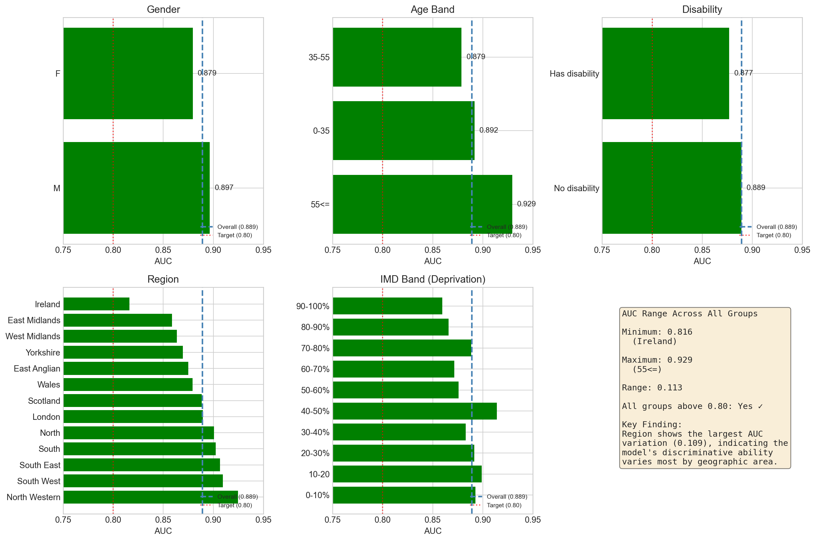
overall_auc = 0.889
# Gender
ax = axes[0, 0]
gender_data = sorted(group_metrics['gender'], key=lambda x: x['auc'], reverse=True)
groups = [g['group'] for g in gender_data]
aucs = [g['auc'] for g in gender_data]
colors = ['green' if a >= 0.80 else 'red' for a in aucs]
bars = ax.barh(groups, aucs, color=colors)
ax.axvline(x=overall_auc, color='steelblue', linestyle='--', linewidth=2, label=f'Overall ({overall_auc:.3f})')
ax.axvline(x=0.80, color='red', linestyle=':', alpha=0.7, label='Target (0.80)')
ax.set_xlim(0.75, 0.95)
ax.set_xlabel('AUC')
ax.set_title('Gender')
ax.legend(loc='lower right', fontsize=8)
for bar, auc in zip(bars, aucs):
ax.text(auc + 0.005, bar.get_y() + bar.get_height()/2, f'{auc:.3f}', va='center', fontsize=10)
# Age Band
ax = axes[0, 1]
age_data = sorted(group_metrics['age_band'], key=lambda x: x['auc'], reverse=True)
groups = [g['group'] for g in age_data]
aucs = [g['auc'] for g in age_data]
colors = ['green' if a >= 0.80 else 'red' for a in aucs]
bars = ax.barh(groups, aucs, color=colors)
ax.axvline(x=overall_auc, color='steelblue', linestyle='--', linewidth=2, label=f'Overall ({overall_auc:.3f})')
ax.axvline(x=0.80, color='red', linestyle=':', alpha=0.7, label='Target (0.80)')
ax.set_xlim(0.75, 0.95)
ax.set_xlabel('AUC')
ax.set_title('Age Band')
ax.legend(loc='lower right', fontsize=8)
for bar, auc in zip(bars, aucs):
ax.text(auc + 0.005, bar.get_y() + bar.get_height()/2, f'{auc:.3f}', va='center', fontsize=10)
# Disability
ax = axes[0, 2]
disability_data = sorted(group_metrics['disability'], key=lambda x: x['auc'], reverse=True)
groups = ['No disability' if g['group'] == 'N' else 'Has disability' for g in disability_data]
aucs = [g['auc'] for g in disability_data]
colors = ['green' if a >= 0.80 else 'red' for a in aucs]
bars = ax.barh(groups, aucs, color=colors)
ax.axvline(x=overall_auc, color='steelblue', linestyle='--', linewidth=2, label=f'Overall ({overall_auc:.3f})')
ax.axvline(x=0.80, color='red', linestyle=':', alpha=0.7, label='Target (0.80)')
ax.set_xlim(0.75, 0.95)
ax.set_xlabel('AUC')
ax.set_title('Disability')
ax.legend(loc='lower right', fontsize=8)
for bar, auc in zip(bars, aucs):
ax.text(auc + 0.005, bar.get_y() + bar.get_height()/2, f'{auc:.3f}', va='center', fontsize=10)
# Region
ax = axes[1, 0]
region_data = sorted(group_metrics['region'], key=lambda x: x['auc'], reverse=True)
groups = [g['group'].replace(' Region', '') for g in region_data]
aucs = [g['auc'] for g in region_data]
colors = ['green' if a >= 0.80 else 'red' for a in aucs]
bars = ax.barh(groups, aucs, color=colors)
ax.axvline(x=overall_auc, color='steelblue', linestyle='--', linewidth=2, label=f'Overall ({overall_auc:.3f})')
ax.axvline(x=0.80, color='red', linestyle=':', alpha=0.7, label='Target (0.80)')
ax.set_xlim(0.75, 0.95)
ax.set_xlabel('AUC')
ax.set_title('Region')
ax.legend(loc='lower right', fontsize=8)
# IMD Band
ax = axes[1, 1]
imd_order = ['0-10%', '10-20', '20-30%', '30-40%', '40-50%', '50-60%', '60-70%', '70-80%', '80-90%', '90-100%']
imd_data = {g['group']: g for g in group_metrics['imd_band_imputed']}
groups = [g for g in imd_order if g in imd_data]
aucs = [imd_data[g]['auc'] for g in groups]
colors = ['green' if a >= 0.80 else 'red' for a in aucs]
bars = ax.barh(groups, aucs, color=colors)
ax.axvline(x=overall_auc, color='steelblue', linestyle='--', linewidth=2, label=f'Overall ({overall_auc:.3f})')
ax.axvline(x=0.80, color='red', linestyle=':', alpha=0.7, label='Target (0.80)')
ax.set_xlim(0.75, 0.95)
ax.set_xlabel('AUC')
ax.set_title('IMD Band (Deprivation)')
ax.legend(loc='lower right', fontsize=8)
# Summary statistics
ax = axes[1, 2]
ax.axis('off')
# Calculate summary stats
all_aucs = []
for attr in group_metrics:
for g in group_metrics[attr]:
all_aucs.append({'attr': attr, 'group': g['group'], 'auc': g['auc'], 'n': g['n']})
auc_df = pd.DataFrame(all_aucs)
min_auc = auc_df['auc'].min()
max_auc = auc_df['auc'].max()
min_group = auc_df.loc[auc_df['auc'].idxmin()]
max_group = auc_df.loc[auc_df['auc'].idxmax()]
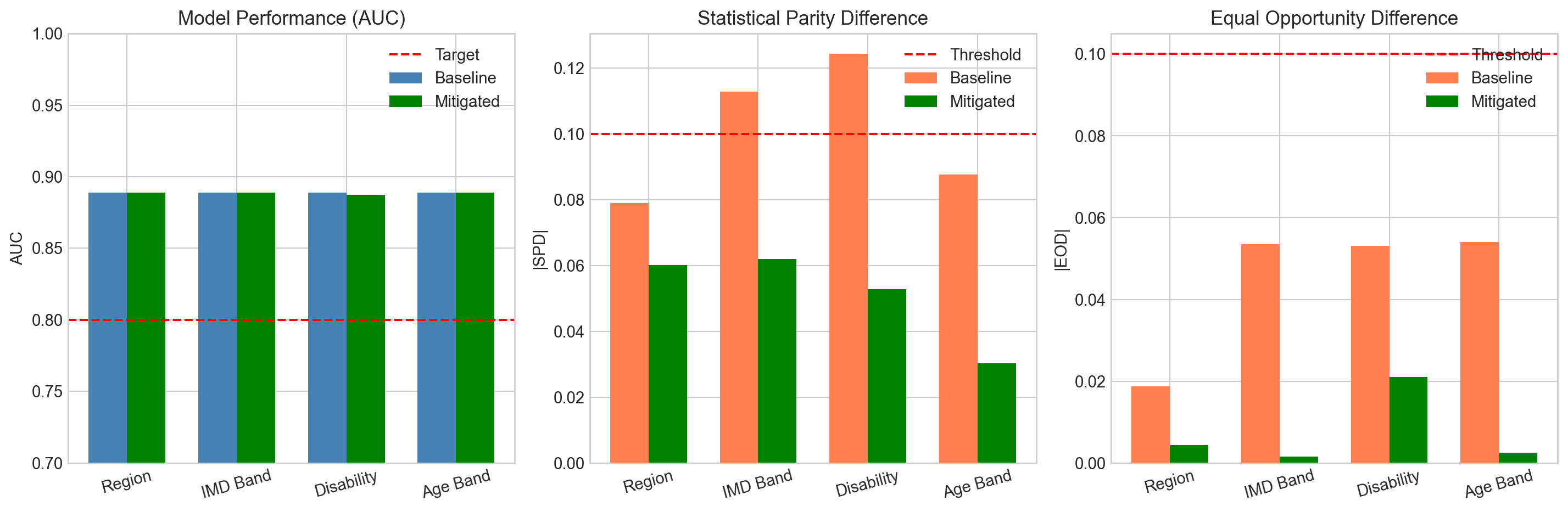
summary_text = f"""AUC Range Across All Groups
Minimum: {min_auc:.3f}
({min_group['group']})
Maximum: {max_auc:.3f}
({max_group['group'].replace(' Region', '')})
Range: {max_auc - min_auc:.3f}
All groups above 0.80: Yes ✓
Key Finding:
Region shows the largest AUC
variation (0.109), indicating the
model's discriminative ability
varies most by geographic area."""
ax.text(0.1, 0.9, summary_text, transform=ax.transAxes, fontsize=11,
verticalalignment='top', fontfamily='monospace',
bbox=dict(boxstyle='round', facecolor='wheat', alpha=0.5))
plt.tight_layout()
plt.show()